
http://calendarbudget.com/blog/the-financial-planning-process-simplified/
This diagram represents the Financial Planning process very well, though it does follow a slightly different order than that presented in the Fundamentals of Financial Planning textbook. It is definitely more focused on one's own personal use, rather than for use in creating a financial plan for another person. It does, however, present information quite well given its format. Additionally, the color scheme makes this diagram more visually appealing and splits the steps more clearly than the other two diagrams presented here. The circular pattern it follows is key in illustrating the idea that financial planning is an ongoing process; once one cycle is complete, one must continue to evaluate and reevaluate their goals and situation.
http://wealthplannersgroup.net/about.html
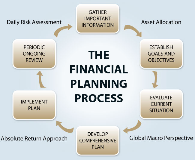
This diagram represents the process somewhat well, but slightly less so than the previous diagram. All of the necessary information is provided, yet it is comparatively less visually appealing. It is, however, a bit more professional in its presentation. In addition, it also presents the information in a cyclical format, once again showing the financial process to be more than just a one time process. This diagram is less detailed than the first, however. This fact, combined with the relatively dull appearance, makes this diagram slightly less effective. Nevertheless, it still gives an accurate picture of what the financial planning process entails, and, as such, is a good representation thereof.

http://www.riscario.com/financial-planning-process
This final diagram is, in my opinion, the least effective of the three. While it does give most of the main steps, it is very general, lacking in details. Furthermore, this diagram implies that the financial planning process is a single event rather than on an ongoing cycle of events. It mentions updating the plan as part of the process, yet the layout of the diagram does not fit in with that action. While this could be considered a decent illustration, I consider it to be the weakest of the three, mainly because I find it to be somewhat visually ineffective in showing the perpetual nature of the process. Keep in mind that this diagram is not necessarily incorrect; it is only somewhat inadequate.
All of the content contained with this portfolio is for educational purposes only.
